How to Master the More Is More Look at Home
When it comes to decorating, the minimalist look most notably known for its stark walls, serene color schemes, and clean, simple lines has peaked. And that’s good news for those of us who are starved for maximalist inspired interiors brimming with color and pattern. But here’s the thing—maximalism isn’t about filling every square inch in your home with stuff. It is more about the art of combining colors, prints, and eclectic embellishments. To help you master the modern take on the more-is-more look, we gathered chic examples from top interior designers.
An Urban Flat With Plenty of Style
:max_bytes(150000):strip_icc():format(webp)/urban-open-plan-interior-design-package-sofa-e25198203345485b8853d78d82e66d6c.jpg)
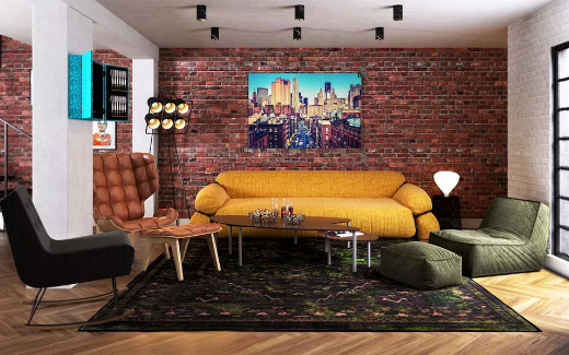
At the heart of any maximalist space is a bold combination of colors and textures as shown in this basement apartment by Black and Milk Interior Design. A brick wall brings a big dose of urban character while providing a stylish contrast to the sleek oak herringbone floor. An exciting mix of mismatched seating enhances the room’s eclectic vibe. Anchoring the living space is the patterned rug that pulls all the earthy and jewel tones throughout the area together. While many maximalist homes have walls covered in art, this space includes a bold cityscape print that stands out like a punctuation mark.
A Graphic and Bold Living Room
:max_bytes(150000):strip_icc():format(webp)/tra150414_090-2-cfed336ded91443babb4ad86ea09df3a.jpg)
Bright white walls set the stage for an explosion of color and pattern in this living room by Holly Hollingsworth Phillips, the interior designer by The English Room. The curtains, rug, and accent pillows each feature a distinct pattern. Three things make them blend beautifully together. The first is scale; each item features a different sized motif. Next is color—each piece features the same hues in equal intensity. Lastly, each boldly patterned feature is offset by something in a solid color. The curtains are against a crisp wall, and the rug and decorative pillows are combined with furnishings in solid hues or metallics.
A Quirky Pattern-Mixing Apartment
Bold colors and patterns are essential ingredients in a maximalist-inspired home. Adding wallpaper, curtains, and decorative accessories in a rainbow of hues and motifs can help you max out your current decor. Here, Designs by Humans does just that in this quirky NYC residence, filled mostly with furniture in neutral colors. Floral print curtains bursting in shades of red, green, pink, and yellow draw the eyes across the room. On the wall behind the sofa is wallpaper in a blue and white pagoda pattern—a stunning contrast from other prints and textures in the room. Luxurious metallic finishes and colorful decorative pillows help to connect the dots between the extreme prints.
Full, Busy Walls With Complementary Contrast
Dressing up your walls may be the most fun way to rock the more is more trend. The owner of this Swedish apartment spotted on Alvhem says she loves to display her favorite things, including a treasured collection of photos shown on the wall. The bold wallpaper over the sofa is textured and it appeals to her tactile sense. Note the little objects throughout the room from the small guitar in the corner to the glass accessories on the coffee table, all are carefully curated and arranged.
A Dining Room Making the Most of Ceiling Space
Add drama to a traditional dining room with a wallpapered ceiling. Decorating your “fifth wall,” as shown in this space by interior designer Laura Umansky, is a fantastic way to introduce maximalist style in any room in your home. Don’t forget to top it off with a statement-making light fixture.
A Kitchen With Bold Colors and Bright Patterns
:max_bytes(150000):strip_icc():format(webp)/IMG_6497.F-5abfaaea642dca003613651b.jpg)
Kitchens can also rock the maximalist trend without adding a lot of stuff to the equation. This white kitchen by interior designer Janet Gridley takes it to the max with bright colors and bold patterns.
Source: The Spruce
Collected and published by Arms &McGregor International Realty® editorial team. Get in touch with us at [email protected]

