Last month we shared how refinishing the floors at the duplex made us feel like we turned a major corner at a house we’ve been renovating for over a year (remember when it looked like this?. And now we are firmly in “the fun part!” You know, where you get to start bringing in rugs and light fixtures and furniture and accessories so it goes from looking like a construction zone to an actual home. It’s THE. BEST. Especially after months and months of expensive improvements that you don’t even see when the drywall goes back up (like plumbing and electrical upgrades).
So let’s just get right into it. Behold, this wall of the left side’s master bedroom that we pretty much rebuilt from scratch:
That rug is the one we originally bought for the pink house’s living room (you can see it there in this post) but it often looked too dark paired with our dark sectional. But in this room with a fluffy white bed on top of it, we think it’ll look worlds lighter and brighter – especially paired with our pretty pink closet doors and that capiz chandelier that we hung between them.
We actually added those two closets during framing because it was the largest room but it didn’t have a closet at all originally. So we thought flanking the window with two of ’em added lots of storage and symmetry (whereas just one closet would take a bite out of the corner of the room and feel less balanced).
Here’s the same bedroom, as you view it from the door. We can’t wait to add some thick wooden shelves in that little chimney nook that we were able to expose during the renovation.
Below is a similar view of this bedroom when we bought the house. It was just a boring box, complete with a drop ceiling to hide a whole lot of mold and rot that was going on above it.
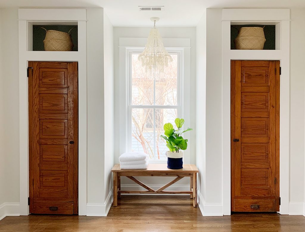
The photo below is a picture of the back bedroom on the other side (the right side of the duplex) as it looks now. Over here we reused the only set of original doors that we could salvage: these cool skinny little pine doors, complete with their original hardware.
They have tiny little latches on each side that stole my heart the second I saw them, along with little faux drawers at the bottom with old cup pulls. So much quirk & character!
And since they’re not standard height (they’re shorter than standard interior doors) we got to add cute little cubbies above them. I love how the curved baskets bring in some texture and some softness with so many rectangles going on around them. Same with the curved chandelier.

We’re also pretty excited about our kitchen progress, since we worked over the holiday break to assemble both sides but we’re really happy to be mostly over that hump. The appliances are on their way, and our counters should be getting templated and installed before the end of the month. We can see the finish line!!! (Ok, and then we have to add shelves, hardware, and a bold patterned backsplash, but we’re closer to the end than the beginning!)
That’s the kitchen on the right side and here we are in the adjacent mudroom/laundry room. We still need to build in that storage cabinet, but we’re waiting for the stacked washer & dryer to be installed first. And those painted pocket doors (they’re Oyster Bay by Sherwin Williams) lead to the kitchen, and will probably stay open most of the time. We added them in case people want to shut out the noise when laundry’s going. And because they’re just so dang cute.
We’ll also be adding lots of mudroom storage in here, like hooks and baskets galore for shoes, bathing suits, towels and all that good stuff. The outdoor showers are a few steps away from the back door that leads into this room, so this space is going to be a workhorse for sure.
Ok, but now let’s take a peek at the kitchen on the left side of the duplex. We chose some moody blue-green-gray cabinets for this side, but they look bright blue here. Wait for it…
They’re still covered with a protective film that we aren’t going to remove until after the appliances and counters are installed, but you can see from the piece John’s holding up below that they’re a lot grayer and greener underneath the film. We LOVE the color for a beach house. Feels really playful but not too out there.
This is the mudroom off of that kitchen, where we did a similar tile pattern as the other mudroom, but in a totally different colorway. We love how each side feels related to the other side – but not identical. Kinda like they’re cousins but not twins. We still need quarter round trim in here (most of the other rooms are done – but we held off on this room so we can add a few built-ins and then install it).
So those are just a few of the spaces that look SO MUCH BETTER already – even before our huge truckload of furniture arrives (yes, we’re renting a giant box truck and driving things down ourselves in less than a week!). But even without all the beds and tables and sofas and chairs that are coming, we’re soaking up this PROGRESS, BEAUTIFUL PROGRESS! And you know I’m counting down the days until I can share more photos with furniture and curtains and art and ALL THE THINGS!!!
Source: younghouselove.com

