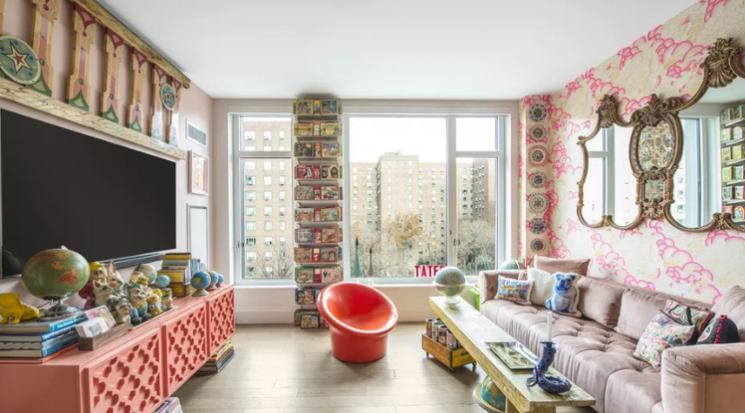
With all the emphasis on minimalism over the last several years, we knew it had to roll over for the next big thing. Enter: Maximalism. Maximalist style was a reaction to the minimalist movement and has aspects and elements that are practically the polar opposite to minimalist components. White walls, minimally decorated walls, and quiet color palettes are a no-go for maximalism. When it comes to decor, the bigger, brighter, and busier the better. Think precious photographs, prized collections, and eclectic furniture, which you may have acquired over time, often in a rainbow of colors, textures, and styles. Rather than displaying one or two of these aspects, this style takes and utilizes all of them.
What is Maximalism?
What was once a category of music, visual art, and literature has now expanded into the world of interior design. A common misconception is that maximalism encourages hoarding items and overstuffing rooms. While it embraces the idea of excess, it’s not in the way you might think. It promotes repetition, patterns, bold palettes, intricate graphic details, and one-of-a-kind possessions. Maximalism is a loud style composed of mixed patterns, excessive, but curated collections, and saturated colors. Its strongly opposed counterpart minimalism encourages paring everything down to its bare minimum, but maximalism encourages utilizing your space in the boldest way possible. Its ornate nature is reminiscent of the stately home interiors that can be found in England, but the bold colors, and modern accents are what updates maximalist style and makes it modern.
:max_bytes(150000):strip_icc():format(webp)/Curated-Books-Apartmentjeanie-24073d5847634a789551a8fe1f6cbc2d.jpg)
Elements of Maximalism
Those exquisite maximalist interiors you may have seen on Pinterest or Instagram can feel intimidating. It is essential to remember when maxing out your style at home it is all about you and your unique taste. “Maximalism is, in a way, much more personal than minimalism. People are not just one thing; they are complicated and complex and multifaceted—and maximalist decor expresses that,” says Nicole Alexander, principal interior designer behind the firm Siren Betty Design. This style allows your personality and experiences to shine through much more easily than in a minimalist space. When it comes to identifying a maximalist space, these are some key characteristics:
- Layering
- Repetitive patterns in prints such as florals, abstract, and animal prints
- Rich, bold colors
- Unique statement pieces
- Mixing and matching of textures and colors
- Multiples of items like books, statues, artworks etc.
- Blending of styles—oftentimes but not limited to classic, eclectic, and boho
Alexander mentions that combining rugs, wallpapers, paintings, and photos can be a great start for curating a maximalist room. “Add furniture in different patterns and colors—each layer should share the story of your home or the people who occupy the space.”
:max_bytes(150000):strip_icc():format(webp)/AH_Adler_3050-33ed4a0456a24ccb8508e13a901a04ac.jpg)
How to Incorporate Maximalist Style in Your Home
The best way to adopt the more-is-more trend is to start slow. Adding color, layering patterns, and displaying sentimental pieces of decor is a good place to begin. Keep in mind maximalist can look cluttered, so try to avoid over-accessorizing. Interior designer Anne Hepfer says, “My recommendation is to start with books, throw cushions, and plants. Then select a favorite object to put on top of your stack of books. The idea is to add a few pieces at a time. If you already own a lot of extra accessories, consider filling a bookcase to create a sense of order.”
:max_bytes(150000):strip_icc():format(webp)/HenryClayAve-98161-2b642bd1ff5c44fea5bdfe53044fd849.jpg)
And here’s another pro tip. Interior designer Isabel Ladd says that animal prints, such as leopard and snake can serve as neutral bases for a maximalist space. The colors of the prints themselves aren’t over the top, so mixing these patterns can create a maximalist feeling in the room that isn’t too obnoxious or noisy.
Source: The Spruce
Collected and published by Arms &McGregor International Realty® editorial team. Get in touch with us at [email protected]

